
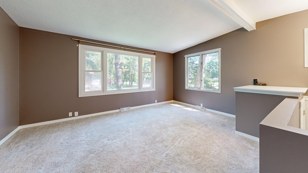
I start by defining my target mood: relaxed, modern, cozy, or casual. This choice guides every color decision. I test paint samples from local stores, using peel-and-stick options and 8 oz samples on multiple walls. I observe how lighting changes throughout the day. Northern light casts cool tones while southern light brings warmth. I photograph my samples morning, noon, and evening to track these shifts. I select my sheen carefully, choosing matte for softness or higher sheen for depth. The sections ahead walk through each step in detail.
Start With Your Living Room’s Target Mood
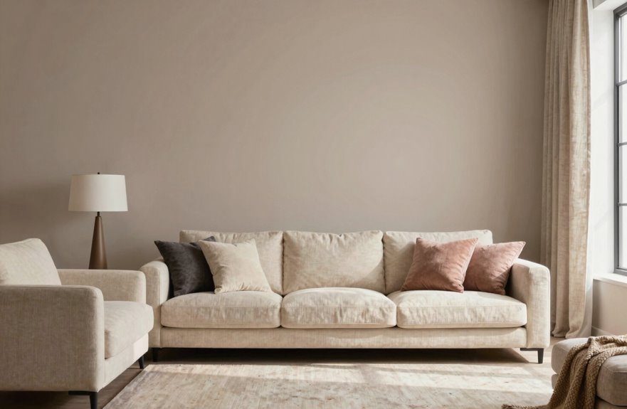
Three key elements shape every successful living room color choice, and mood sits at the top of that list.
I always begin by defining my target mood. Do I want relaxed, modern, cozy, or casual. This decision guides every subsequent choice. Once I’ve clarified my target mood, I select mood-aligned colors that reinforce that atmosphere. The right living room color doesn’t just look good; it functions as the foundation for how the space feels.
I seek color guidance from local, independently owned paint stores. These experts help me navigate options I might overlook. Before committing, I examine lighting effects throughout the day, since natural and artificial light dramatically alter how wall color appears. I use paint samples, test swatches, and peel-and-stick options to evaluate choices in my actual space. This methodical approach ensures my final selection genuinely communicates my intended mood.

【Vintage Christmas Wall Art】Refresh your space and add a touch of charm to your holiday décor with our Christmas tree wall art. Exuding a cozy, rustic winter vibe, this piece features a snow-dusted pine tree that creates a warm and festive atmosphere. Designed to bring warmth and joy to any room, this classic vintage-style artwork is the perfect choice for celebrating the season. Let this elegant piece serve as a focal point, creating a serene winter wonderland ambiance that captivates everyone who sees it.


Blackout & Thermal Insulation: premium polyester, blocks light, absorbs heat in summer, retains warmth in winter, suitable for year-round use.
Choose From 6 Proven Living Room Color Palettes
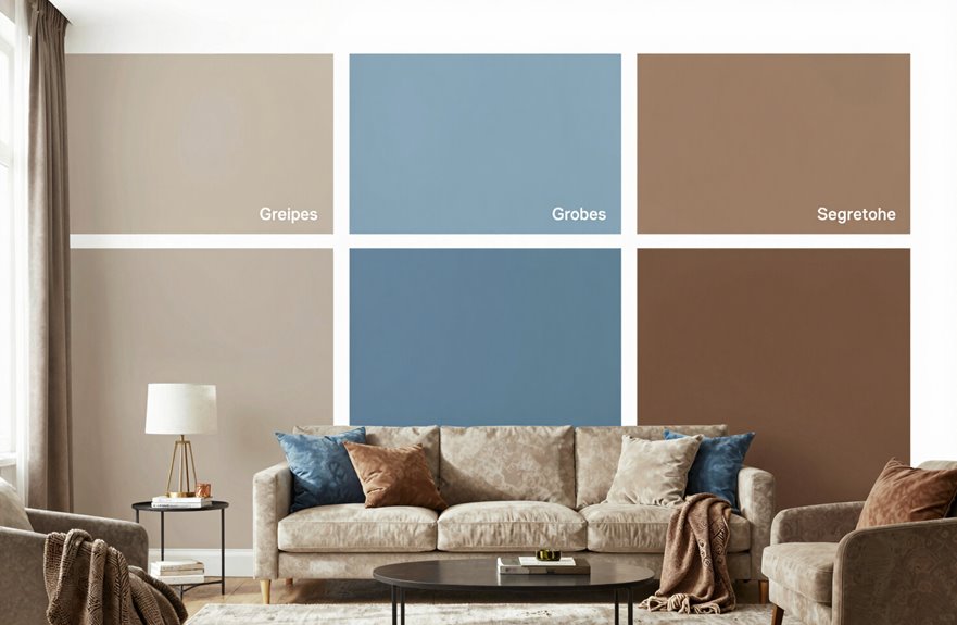
I’ll walk you through six proven palettes that balance neutral anchors against vivid accents. White Dove or Chelsea Gray can ground a room while Black Raspberry or Hibiscus inject personality. You’ll need to test these options against your actual lighting conditions, since northern exposures cool colors down and southern light warms them up. Grab swatches from your local Benjamin Moore store, and I’ll explain how to read undertones so you don’t end up with a gray that reads purple or a white that turns pink.

Charming Wildflower Design – This set features three beautifully illustrated wildflower and botanical prints, adding a touch of nature-inspired charm to any space. Perfect for boho, rustic, or feminine decor styles.
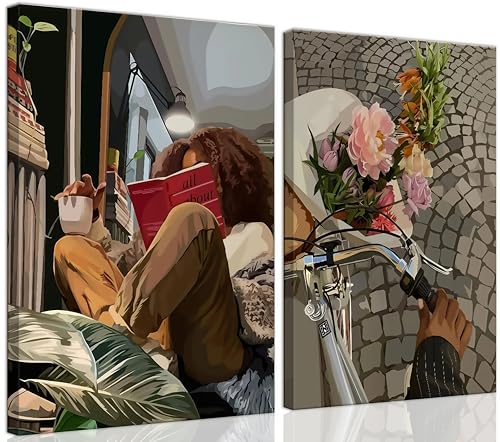
This 2-piece wall art set captures moments of everyday joy: a woman enjoying a cozy reading nook and a peaceful bike ride with fresh flowers. Perfect for creating a warm and inspiring atmosphere. Perfect for adding personality to blank walls while inspiring calm and creativity in any room

Vintage Wall Decor Posters: Inspired by the cottage core home of France, this vintage pictures set blends dark moody wall art, feminine details with elements of vintage antique decor. The vintage paintings are sure to be the feature in your space
Neutral Versus Vivid Options
Choosing between neutral and vivid wall colors means weighing versatility against visual impact. Neutrals like White Dove and Cotton Balls create a sense of openness in shared spaces.
For your foundation, consider these three approaches:
- Warm whites and pale neutrals establish soothing backdrops for textures
- Gray options deliver modern, classic versatility across design schemes
- Vivid hues like Black Raspberry or Kensington Blue create bold, high-impact statements
Your lighting conditions will guide this choice significantly. Warm whites expand smaller rooms, while deeper tones require professional application for durability. Start with Cotton Balls or pale neutrals if you seek flexibility, then layer bolder accents through furnishings. This approach allows you to adapt your space without repainting, keeping your living room welcoming for everyone who gathers there.
Lighting and Undertones
How does a color that looked perfect in the store turn completely different on your wall? Lighting changes everything.
Understanding Your Space
Room exposure determines how natural light enters your living room. Southern and western light run warm, so balance them with cooler undertones. Northern and eastern spaces need warmth to avoid coldness.
Testing Before Committing
Color testing is essential. Apply 8 oz. samples and Peel & Stick tests to multiple walls, checking morning, afternoon, and evening light. This reveals true undertones that flat cards hide.
Selecting Finishes
White paint isn’t simple. Undertone balance matters. Pair higher reflectivity with Ultra-premium Aura Interior paint finishes to control glare and depth.
Your palette must feel right at every hour. Test thoroughly to ensure accurate color selection across all lighting conditions.
See How Light Direction Alters Your Color Choices
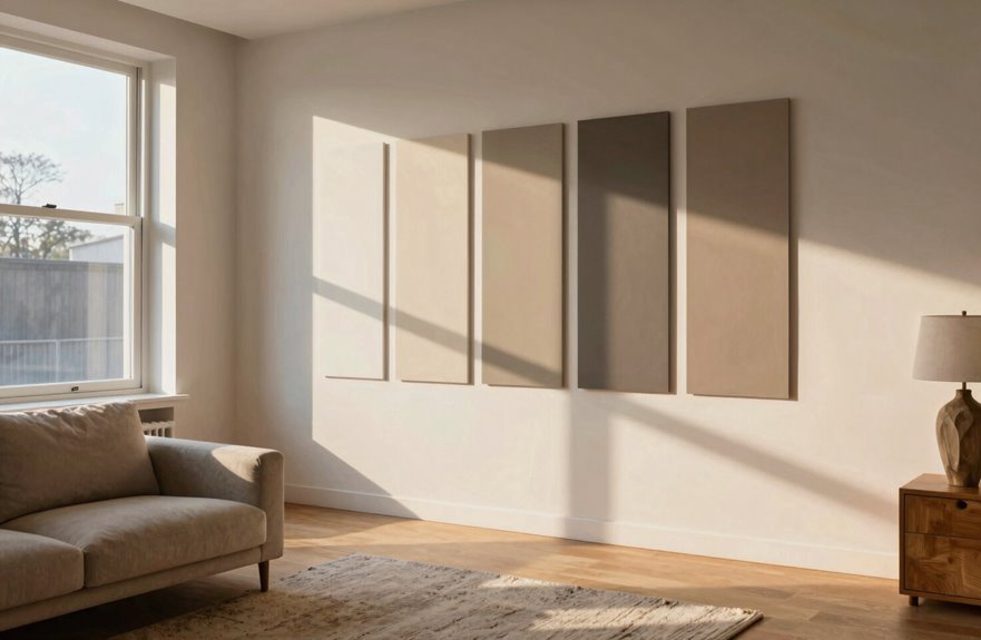
Your room’s orientation shapes every color decision you’ll make. North-facing light casts cool, blue-gray tones that can drain warmth from your walls, while south-facing sun floods spaces with intense, warm light that shifts colors toward yellow. East and west exposures create their own challenges, with morning light that feels crisp and cool versus afternoon sun that turns golden and intense. Understanding how to work with each direction is essential for selecting colors that perform well in your specific space.

[Framed Wall Art]: This set of 2 long narrow vertical wall paintings features sturdy black frames with a 35mm thick frame profile, helping support each tall 20x60 inch panel and giving the artwork a clean, finished look. The thicker framed edge adds structure and makes the tall panels feel more complete on the wall

[Premium Quality Materials] High definition modern artwork printed onto industrial grade framed canvas.

Hand-Painting: The abstract wall art 100% hand-painted by our professional artists, due to its thick texture, has a strong concave and convex feeling on its surface
North-Facing Light Effects
The quality of light streaming through your windows shapes every color choice you’ll make. North-facing light casts cooler, bluer tones throughout your living room, which means you’ll need to consider undertones carefully to avoid a cold, unwelcoming space.
For north-facing rooms, follow these three steps:
- Choose warm white or soft neutrals to counteract the cool cast
- Select colors with higher light reflectance values to maximize brightness
- Test large samples at different times to see true color shifts
Your lighting strategy matters equally. Without direct sunlight, you’ll balance cool vs warm tones through fixtures and bulb selection. This approach prevents that moody, dingy feeling and creates a functional gathering space.
South-Facing Sun Impact
Why does your south-facing living room feel so intense by midday? South-facing spaces receive strong warm daylight, and this sun impact can dramatically alter your living room color choices. The light exposure in these rooms makes undertones read warmer than they actually are, so careful selection of hues that balance this effect is essential.
| Morning Light | Midday Intensity |
|---|---|
| Soft golden entry | Harsh, direct beams |
| Colors appear true | Whites glare, colors saturate |
| Gentle shadow play | Minimal contrast, flat appearance |
| Cool hues stay balanced | Warm daylight dominates |
Testing color samples on multiple walls throughout the day reveals how they shift with changing light. For white balance, cooler tones or light-reflecting whites counter oversaturation effectively. Premium finishes like Aura Interior emphasize depth under intense southern light, making verification under actual sunlight necessary before final selection.
East-West Exposure Dynamics
How dramatically does your living room transform from sunrise to sunset? East-facing rooms glow with warm morning light, then fade to cooler afternoon shadows. West-facing spaces do the opposite: soft starts build to intense, warm evening daylight.
Your lighting direction directly controls color perception and room mood throughout the day. Balance these shifting conditions with these strategies:
- East-facing rooms: Choose slightly warmer undertones to maintain energy as morning light departs
- West-facing rooms: Select cooler color temperature to counteract harsh afternoon warmth
- Both exposures: Test samples at multiple times to verify consistent color perception
Pair these strategies with quality finishes that enhance depth. Understanding your daylight patterns ensures your walls reflect deliberate choices rather than default selections, creating spaces where you truly belong.
Coordinate Colors With Your Existing Furniture and Art
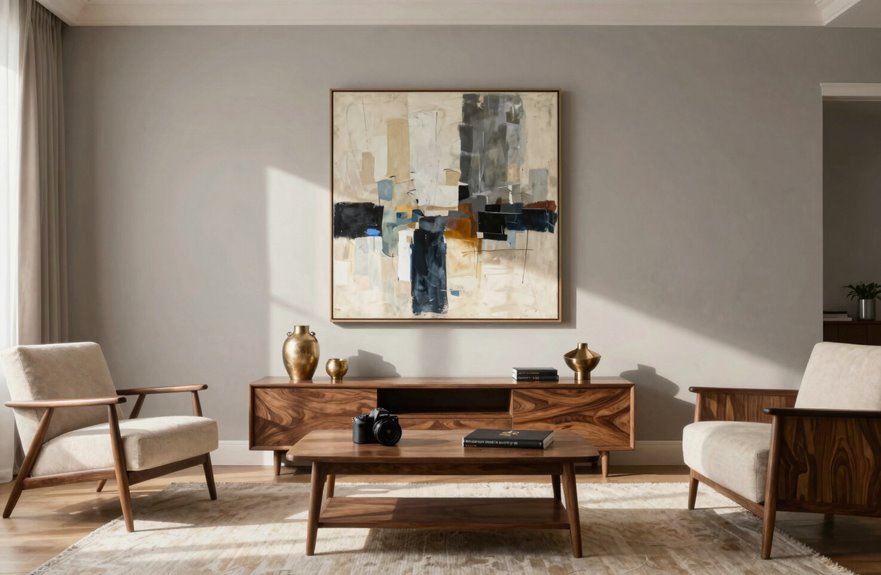
Where exactly should your wall color sit in relation to your sofa, your rug, and that painting you love? Consider it as building a color hierarchy where your walls serve as the supporting actor, not the star.
| Element | Role in Coordination |
|---|---|
| Wall color | Backdrop that unifies furniture and art |
| Undertones | Bridge between warm or cool existing pieces |
| Lighting | Reveals true color relationships |
Test neutral swatches directly against your sofa fabric and frame colors. Warm undertones in Cotton Balls complement oak furniture, while Chelsea Gray’s cool base harmonizes with steel accents. Peel-and-stick samples let you verify coordination under your actual lighting before committing.

COLORS CRAFTED BY ANNIE SLOAN: A timeless off-white, that works with everything. Old White is a sophisticated and understated neutral that will give your walls a soft, chalky, traditional look and feel.

Use for a variety of indoor and outdoor project surfaces including wood, metal, plaster, masonry or unglazed ceramic

PAINT plus PRIMER: KILZ TRIBUTE is a low VOC, 100 percent acrylic advanced technology paint and primer in one formulated for superior hide and coverage with exceptional durability. Paint and primer covers light-medium stains and light-dark color changes.
Sample Your Top Picks on Multiple Walls
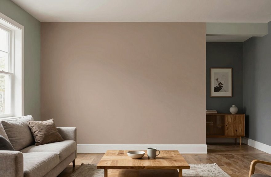
Once you’ve narrowed your options, testing becomes your most reliable decision tool. I test 6–8 wall color samples from my chosen family, using large Samplize peel-and-stick squares I move between testing walls. This reveals how lighting shifts color harmony across your space.
My systematic approach includes:
- Place samples next to existing finishes with white borders to prevent visual clutter
- Apply color scoring 0–10 for each option’s room coordination with furnishings
- Photograph walls morning, noon, and evening to track lighting effects
I paint two coats of my exact finish on one wall section when uncertain. This real-world evaluation removes undercoating bias and confirms true color behavior. Following this methodical process prevents costly repainting mistakes through disciplined sampling.

Water-based, harmless acrylic paint Matte (brushed) finish Smooth and Creamy Paint RPA2023 has good color and durability RPA2023 acid free (acid free)
Select the Sheen That Shows Your Color Best
Why does the same paint color look dramatically different on your walls? Sheen significantly impacts color perception.
Understanding Finish Options
A matte finish absorbs light, softening color and reducing glare for relaxed, understated spaces. High-sheen alternatives reflect light, amplifying depth and vibrancy for dramatic impact. Your finish choice directly shapes how guests experience your living room.
Match Sheen to Your Space
Consider these factors:
- Lighting: Bright rooms handle glossy surfaces; dim spaces need matte to avoid dullness
- Use: High-traffic areas demand durable finishes
Test Before Committing
Paint large room samples with your intended finish. Observe color under lighting at different times. Aura Interior delivers exceptional depth and lighting performance, while Regal Select Interior offers stain-resistant durability for active households.

PET FRIENDLY & NON-SLIP BACKING: 8x10 area rugs featuring simple of colors while promising a luxurious feel underfoot. The blend of a hexagon pattern and a stylish design. Non-slip TPR backing makes the covering for bringing your space together. Make the most of your time at home with our pet-friendly and easy-to-clean area rugs. Elevate the floors of your home with this show-stopping and detailed rug

Quiet Holiday Focal Point: Bright, crowded decorations can make a room feel busy. This single snowy evergreen with softly depicted golden lights creates a calm, nostalgic centerpiece without overwhelming the space, bringing gentle Christmas warmth above a mantel, console, or living room wall.

【Round modern ceiling light material】This LED ceiling light made of high-quality Metal and Aluminum, resulting in resistance, anti-corrosion, anti-faded, not easy to scratch, and easy to clean, thereby assuring long lifespan.