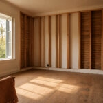
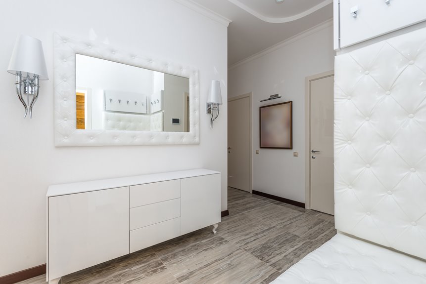
Swap dark paint for lighter neutrals like Accessible Beige with Extra White trim to reduce visual weight and widen your space. Paint walls and trim the same color to create seamless boundaries. Add pendant lights to draw sightlines upward and eliminate oppressive ceiling height. Install shallow board-and-batten for vertical interest without crowding. Choose three large prints instead of cluttered gallery walls. Position mirrors opposite focal points to double perceived width. End with a statement piece that anchors the hallway. These seven strategies transform your tunnel into a deliberate design statement.
Why Your Long Hallway Feels Like a Tunnel (And How to Fix It)
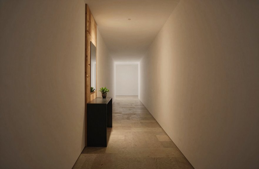
Why does your hallway feel like a tunnel? Dark wall color presses in from both sides, poor hallway lighting keeps your eyes low, and there’s nothing to stop your gaze from seeing only endless length ahead.
Wall Color
Swap dark paint for lighter tones. Accessible Beige with Extra White trim reduces visual weight and visibly widens the space.
Hallway Lighting
Add upward-focused fixtures that draw the eye toward the ceiling, expanding perceived height and airiness.
Focal Point
Place a substantial mirror or decorative piece at the hallway’s end. This redirects attention, interrupts the tunnel perspective, and creates a destination worth reaching.
Texture Without Clutter
Apply shallow board-and-batten or a patterned runner. These add interest without crowding walls, maintaining openness throughout your corridor.

Perfect Kitchen Island & Breakfast Bar Lighting: Effortlessly adjust height (10.24"-68.9") to center light over your prep area or dining spot. Ideal for illuminating islands, sinks, and bars in spaces up to 40 sq ft

Quality: Modern design pendant with high quality workmanship. Voltage: 110-120V.
Start With Pendant Lights That Brighten Dark Corners
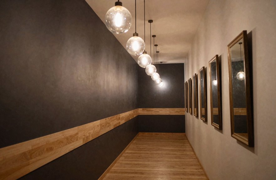
Pendant lights transform a dim corridor into a navigable space. Strategic pendant lights draw the eye upward, which reduces that tunnel-like feeling you’re probably experiencing. When you brighten dark corners with pendant lighting instead of recessed fixtures, you immediately create hallway illumination that adds visual height and layered depth.
If your ceiling hits ten feet or taller, pendant lights become essential tools. They accent that vertical space while pushing light into shadowed areas you’d otherwise miss. The corridor feels wider, even before addressing wall treatments. A thoughtful pendant layout also reflects onto lighter surfaces, amplifying brightness throughout.
Pendant lights reshape your space by:
- Drawing sightlines upward to eliminate oppressive ceiling height
- Replacing recessed fixtures for layered, dimensional lighting
- Accenting vertical space in corridors with ten-foot ceilings or higher
- Reflecting illumination onto surfaces for amplified brightness
- Creating perceived width through strategic height and placement

【Unique Design】Oval shaped wall mirror stands out with its unique exterior design. The oval shape not only enhances decoration but also provides a larger viewing area, allowing you to easily observe more areas in the mirror but also adds a touch of grace and sophistication to your living environment.

Dimenson:Mirror with frame 44"X8"
Paint Your Long Hallway Walls and Trim the Same Light Neutral
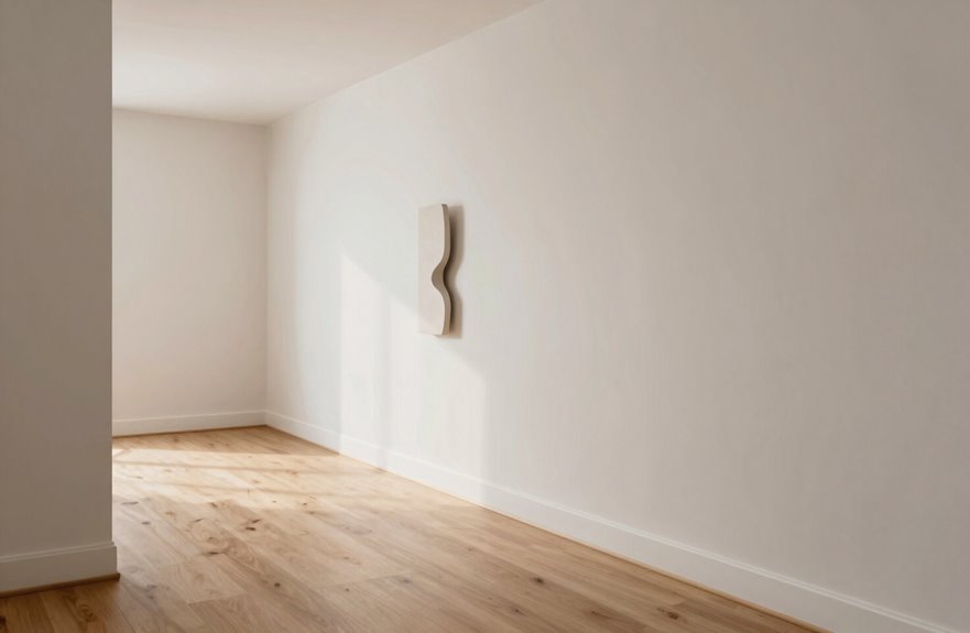
How can you make a narrow corridor feel instantly wider? Paint your hallway walls and trim the same light neutral to achieve a seamless result.
Create Seamless Boundaries
Using one neutral paint across walls and trim eliminates visual breaks. When wall color flows uninterrupted from baseboard to ceiling, tunnel effects dissolve. Sherwin Williams Accessible Beige on walls with Extra White trim demonstrates this approach with soft contrast and maximum cohesion.
Maximize Light Reflection
Your neutral paint becomes a reflector. Lighter tones bounce existing and added overhead lighting, making pendant fixtures appear more effective. Board and batten details read as subtle enhancements, not heavy distractions.
Coordinate With Existing Elements
Select neutrals that complement warm wood floors. This prevents jarring contrasts and maintains inviting flow throughout your home.
One color choice transforms how a space feels. The unified approach eliminates competing visual elements that fragment the space.

All-in-One Design - Package of 20 premade molding trim slat + 4 decorative edge strip create instant board & batten walls
All-in-One Design - Package of 10 premade molding trim slat + 2 decorative edge strip create instant board & batten walls

Board and Batten Wall Design : Include 10 premade molding trim slats and 2 decorative edge strip. No measuring or extra shopping. Everything you need for a accent wall, ready to assemble right out of the box
End Your Hallway With a Statement Piece That Stops the Eye
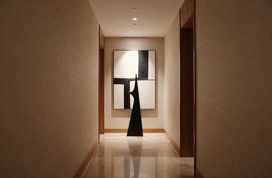
I anchor my hallway’s end wall with a single bold focal piece: oversized artwork, a sculptural console, or a curated trio of large prints. This stops the eye and prevents that tunneling effect. I position this visual anchor at the corridor’s terminus, ensuring it contrasts with lighter walls while coordinating with existing palette elements like Accessible Beige, Extra White trim, and dark floor accents. Targeted pendant or sconce lighting highlights the piece, creating a deliberate destination point rather than an endless passage.

Same Color Gel Same Color Bottle: 1 pc 15ml 0.5OZ Jelly Glaze gel polish,different layers with different effects,need to be cured under UV or LED Lamp for 60-120s. Must apply with Base Gel and Top Coat. Please shake the bottle or warm it with hot water before use, to acheive a better effect.

Same Color Gel Same Color Bottle: 1 pc 15ml 0.5OZ jelly amber gel polish,different layers with different effects,need to be cured under UV or LED Lamp for 60-120s. Must apply with Base Gel and Top Coat. Please shake the bottle or warm it with hot water before use, to acheive a better effect.

Same Color Gel Same Color Bottle Gel Polish: 1 pc 15ml 0.5OZ full size gel polish, different layers with different effects,need to be cured under UV or LED Lamp for 60-120s. Must apply with Base Gel and Top Coat. Please shake the bottle or warm it with hot water before use, to acheive a better effect.
Focal Point Selection
Where does your gaze land when you walk down a long hallway? I guide your eye to a single, deliberate stop at the end wall. This focal point transforms tunnel-like spaces into inviting passages you’ll want to traverse.
- A bold, oversized canvas that commands attention without competing side elements
- A sculptural piece in balanced proportion to your hallway’s width and ceiling height
- A carefully styled wreath or organic form that softens the terminal wall
- Strategic wall color framing your chosen piece to amplify its presence
- Coordinated lighting that spotlights your selection and deepens the stop-and-stay effect
I avoid crowding this moment with a competing gallery wall or opposing mirrors. Instead, I pair one well-chosen statement with a runner and complementary tones. Your hallway becomes a cohesive journey, not a cluttered corridor.
Visual Anchor Placement
Why let your hallway stretch into visual nothingness when a single, well-placed anchor can command the view? Place one prominent piece at the terminus to create an end-wall focal point that immediately arrests the gaze and gives your narrow passage purpose.
Selecting Your Visual Anchor
Choose one bold artwork or substantial wall sculpture. A boxwood wreath combined with coordinating wall art establishes a clear termination point. Scale matters: select pieces large enough to read instantly from several feet away.
Positioning Guidelines
- Avoid clustering multiple small items along the length
- Center your single statement piece at eye level
- Ensure proportion matches your wall dimensions
Integrating Hallway Lighting
Direct attention with targeted illumination. Install a pendant, picture light, or directional fixture that spotlights your visual anchor, reinforcing the end-to-hallway focus and preventing that tunnel effect.
End-Wall Styling
Once you’ve established a visual anchor at your hallway’s end, build out the rest of that wall with intentional styling. Choose one bold end-wall focal point that commands attention without competing elements. A boxwood wreath works beautifully, or select oversized artwork that stops the eye naturally.
Your hallway styling should feel cohesive, not cluttered. Avoid hanging large formal mirrors on narrow end-walls since they amplify length awkwardly. Instead, balance the focal point with complementary pieces along adjacent walls.
For busy homes, prioritize durable materials that withstand daily traffic. Your end-wall deserves statement-making confidence that welcomes everyone who enters.
- Hang one oversized canvas that anchors the space with color
- Position a sculptural object at eye level for immediate impact
- Layer textured greenery like boxwood for organic warmth
- Coordinate accent colors with opposite wall art for balance
- Select wipe-clean finishes that endure scuffs and fingerprints
Install Board and Batten on Narrow Hallway Walls
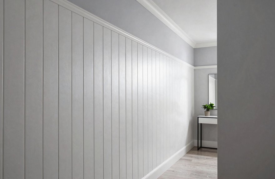
A narrow hallway benefits from vertical visual elements that guide the eye forward rather than emphasizing confining side walls. Board and batten delivers this effect effectively.
Why This Wall Treatment Works
Board and batten creates clean vertical lines that draw attention along the corridor’s length, not its width. Install battens directly on the wall, then caulk and paint everything the same color for a fresh, bright finish without heavy texture.
Practical Considerations
- On textured walls, use a thin board to minimize texture clash while adding visual interest
- Pair this treatment with lighter colors like Accessible Beige and white trim
- The simplified palette maximizes perceived width
This wall treatment expands narrow hallways visually. The unified color scheme eliminates visual breaks and allows the architecture to function without competing elements.
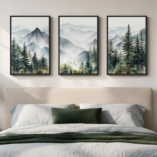
【Framed Landscape Wall Art】Set of 3 large framed mountain landscape canvas prints featuring a foggy forest, distant mountain peaks and pine trees in a soft watercolor style, each panel measures 16"W x 24"H, creating a nature‑inspired scenic triptych that works beautifully as wall art for the living room, bedroom

[Vintage Neutral William Morris Framed Wall Art Set of 3]: Framed with solid wood frames, each piece measures 16x24 inches, total size 24"H x 48"W. Featuring William Morris’s iconic floral patterns with lush wildflowers and fine plant lines, these artworks add vintage charm and timeless elegance to any space

【Botanical Floral Wall Art Set】This framed wall art set includes three botanical floral canvas prints featuring soft watercolor-style wildflowers. The plant-inspired illustrations present a clean, natural appearance designed for decorative wall use.
Choose Three Large Prints Over a Crowded Gallery Wall
I’ve seen crowded gallery walls turn narrow hallways into visual obstacle courses. Three large prints work better than many smaller pieces. This approach eliminates competing focal points while establishing a clean, rhythmic sequence that extends your sightline toward the hall’s end. Space these evenly, roughly 6 to 12 inches apart, and unify them with matching frames that complement your wall color. This creates deliberate cohesion without sacrificing breathing room.

【Adjustable Height Cord Design】The glass pendant lights come with 3 ajustable cord, Maximum Length 3.93ft (47.2inch) which can be adjusted by unscrewing the 3 tightening caps and pull the cord length to fit your ceiling height needs. You can hang the 3-light pendant lighting to the ceiling adjusting higher and lower as you need. This farmhouse light fixtures will be a great choice for decorating the corners of your home.

Teardrop is real glass,solid,heavy and totally gorgeous in weight 2.4lb. It is hand blown and bubbles filled inside. This fixture gives off ample warm inviting light and is so beautiful with the bubbles throwing speckles of light in all directions. Eyes catching and unique. It is a very stylish and trendy light shape and design. Contemporary but blends well with antiques and fantasy decor. Definitely a centerpiece of any room, even when unlit.

Multiple Sizes-The 4.7" D × 5.1" H mini ribbed glass pendant light is perfect for kitchen island lighting, bedside spaces, and small dining areas. The brass finish and clear fluted glass create a warm modern look.
Gallery Wall Drawbacks
Why crowd a narrow hallway with dozens of mismatched frames when three large prints deliver far more impact with far less visual noise? Gallery walls create demonstrable chaos in tight spaces.
- Visual clutter overwhelms your narrow hallway, making it feel smaller than it actually is
- Mismatched frames disrupt spatial flow, creating jarring transitions as you walk
- Multiple small pieces force awkward viewing distances in confined spaces
- Coordinating frame styles and matting consumes excessive time and decision energy
- Dense arrangements compete with end-wall focal points instead of complementing them
Large prints solve these problems. You gain breathing room, simplified coordination, and a cohesive statement that respects your hallway’s proportions. The space functions as a designed choice rather than an accumulated collection.
Triple Print Benefits
Three substantial prints transform your hallway from a cramped corridor into a deliberate design statement.
Large prints outperform a crowded gallery wall in long hallways for these reasons.
Reduced Visual Clutter
Large prints eliminate busy displays that overwhelm narrow spaces. You create breathing room while maintaining visual interest.
Defined Focal Point
Your eye travels naturally down the hall when you establish one clear focal point. Three coordinated pieces guide this movement without fragmentation.
Simplified Maintenance
Fewer frames mean less dusting and fewer touch-ups in high-traffic areas. Walls that receive frequent contact require less upkeep.
Unified Design
Select prints that coordinate with your end-wall wreath and runner rug. This approach ties together color tones and amplifies brightness throughout your long hallway.
Where to Place Mirrors So Your Hallway Feels Wider
Where exactly should you position a mirror to make your hallway feel wider? Place mirrors opposite your main artwork or focal point to double the perceived width without adding clutter. Several options deliver results.
- One large mirror on a side wall bounces pendant lighting throughout the corridor, brightening every step you take
- A full-length mirror leaning at the hallway’s end visually extends your space into another room
- Slim, frameless or black-framed mirrors keep lines clean when square footage is tight
- One or two strategic placements beat multiple small mirrors that create visual chaos
- Bright wall colors paired with ample sconce or pendant lighting maximize each mirror’s reflective power
Avoid clustering small frames. Combine proper lighting with intentional placement to eliminate the cramped tunnel feeling. This approach works because multiple mirrors create visual noise, while one or two well-positioned pieces reflect light effectively and expand the sense of space.

[large oval mirror] Oval full length hanging mirror Measuring[ 16in*48in ] The thickness of frame are 0.7 inch, it‘s a great way to add vertical space and draws your eyes, perfect for opening the room up and to add a elegent touch to room

Black Mirror Dimenson: Thin long oval mirror with black iron frame, measures around 45"X8", G.W: 9lbs, N.W 6.4lbs. Ligthweigt is easy for hang and decor your home.

( Luxury material ): Mirror full length made of acrylic, shatterproof mirror, Acrylic mirror bendable, wall mirror will not be damaged if accidentally dropped on the ground, unbreakable mirror not a real glass mirror, mirrors for wall very safe, your kids and pets can play safely